Labels

Friday, September 28, 2012

DSDN 142 - code experimenting

Code experimenting


Worked out the height and width part of the code i was just being stupid having mind blanks. Also added more dots into. I'm not sure if i will use this code now for the starting.

DSDN 142 - Code experimenting

Code experimenting


Started to change the code of one that I had found that started off to be the dots moving around the the square that followed the mouse around. I got a bit stuck with expanding to be the width and height of the project screen.

DSDN 142 - Investigation

More investigation


With this I just really liked how it manages to expand and randomly curl everywhere. When I saw it I just thought how the sea anemones tentacles would wave and swirl everywhere relating to this processing code partly. 

Thursday, September 27, 2012

DSDN 142 - Open processing code

Pulsating code

As i was browsing through open processing i found something else that someone had scripted that fits well with my design. The similarities are when the mouse swipes over the dots bursting them out and contracting slowly as if they are pulsating partly.


DSDN 142 - Concept

Concept


I forgot to upload this concept earlier as it was a common kinda of concept that a few people had thought of. The idea that I had was have fish that slowly swim around the screen together in a school and when the mouse is dragged onto the page and clicks the fish slowly swim towards a ripple. The ripple expands bigger and when the fish get close they dart away from it. The user will be able to place as many ripples as they want around the page sending the fish being attracted and darting around everywhere. The ripples would fade out after a short amount of time once clicked. I also had the idea of adding food that may attract the fish as if you're baiting them. 

Tuesday, September 25, 2012

DSDN 142 - Interaction look

Interaction look


Designed what my coding would partly look like finished. Decided to do this so I could grasp it more clearly as drawing it didn't exactly show what i was wanting to do. This wouldn't be exactly what my end product would look like but helps to give an understanding.

Monday, September 24, 2012

DSDN 104 - Research

Design precedents research


I found inspiration in dna structer, red blood cells, and viruses. I liked how that the Dna is sp structed and can be turned into something so complex. The white blood cell virus and red blood cells are completly different from the dna structer on how they look. They are alot more abstract  


 I found these 3d printed obejcts were really inspirational on simple some may look but would be so complex to make without a 3d printer or even impossible. I found that the top two images could relate back to the look of the blood cells how they look as a whole structure but with the models they are on a abstract level also with them looking so intricate.


DSDN 112 - App design

App investigation


Started looking at how different apps are layed out for different things and how they are digitally presented. I have noticed that near all the apps are designed to have near black backgrounds with white writing and headers over layered with colours such as greens, blues, reds, oranges ect.

With apps i have noticed that there are not many with fixed menu bars along the top, I would believe as on Android phones they have drop down menus in the actual phone. 

Friday, September 21, 2012

DSDN 142 - OpenProcessing examples

OpenProcessing examples

Grow/shrink
http://www.openprocessing.org/sketch/54831
I found this one interesting as with my project I wanted a series of objects to grow to a certain size and begin to shrink again in a amount of time.

Growth click
http://openprocessing.org/sketch/18943
With this it's much like the one above but has a click added so when clicked it explodes into growths and slows as its bigger.

Dots jiggling around
With this iteraction i wasn't focused on the object being snapped to the mouse but how the dots inside the square move about. They jiggle about randomly how I thought that the dots on my coded screen could look until the mouse hovers over them.

DSDN 142 - Concepts

Concept design


This first story board concept that i thought of was quite complex. The smaller dots would jiggle horizontally while the bigger dot would bounce around the screen at random. If the user clicks and holds on the bigger dot it would explode with a circle growing with colours, the use could also be able to drag the mouse and it would reset with the coloured circles growing out again in different locations where the mouse is moved to. If the user clicks on the smaller dots that are shacking horizontally then I had two ideas that they all could start growing with colourful circles like the big one but overlapping each other, or have basic cross like shapes that explode out then begin to rotate overlapping one another.  
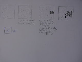

With this concept i had the idea that the smaller dots could be moving around in the screen at random and when the mouse is moved over top of the dots they would rapidly bust out looking like a sea anemone almost. They would burst out rapidly then grow bigger very slowly till a certain size before they shrink back to the small dot and race around the screen again. I have yet to think of another interaction that could be incorporated with using the mouse click.

The inspiration that drew from for the concept above was sea anemone. I had the idea of the long tentacle looking parts when the dots exploded as if it has come to life.


DSDN 112 - App slides

Application slides


Did the design of what three of the screens of the app would look like. the first is the login screen with big lettering at the top with the name of the application and below where you enter your username and password. In the background it will have a faint picture of part of a map. The second slide is of the main menu, It's simple and clean with two buttons and a logout at the top. Again their is the map in the background faintly.  The third slide is of saved locations where the user has taken a  picture of their start point. They can look back and scroll through all the previous places they have taken a picture to see where they are and the fastest route to take to their destination.

Thursday, September 20, 2012

DSDN 112 - Wire frame

Wire frame


I designed a wire frame for my app that I'm designing. I wanted it to have a log in feature so users can have information stored. The user will be able to type in what location they want to go to and take a picture of the location they are currently at. The app will then map out a route to take and also have a feature for alternative routes. Previously pictured locations will be stored.

DSDN 104 - Final hero re-render

Final hero model re-render


After many experiments with different elements I found that this would be the strongest up against the photo of my model that had been taken as the contrasts are similar and the overlapping and overlay of the transparency are able to be seen.

DSDN 104 - Final model photo

Final model photo


I choose this photo as my final as the contrast with the background works well with the acrylic showing the layering of my model and the overlays of parts of the slots. The slotting and overlay of transparency works well as in my 'hero mode' it is very broken up with curved parts over lapping and transparent.

DSDN 104 - Hero re-renders

Hero model re-renders


I re-rendered a wide range of my hero model experimenting with a range of textures such as glass, plastic, and mirror. I played a lot with the translucency and transparency. Lighting was also a huge part that I experimented with to best try and fit my photo of my model. 


DSDN 104 - Model photos

Model photos


I took a wide range of photos of my model trying to hit different angles and the contrast. I really tried to get photos of overlaying of the transparency as in my hero model there are a lot of parts that overlay each other giving off different highlights and mid tones.

DSDN 104 - Layout of acrylic

Cut acrylic layout


All my pieces been laser cut with the protective covering still on. The one in the middle is what it looks like without the covering.

DSDN 104 - Illustrator file

Illustrator file layout


The layout showing what my shapes look like in illustrator. All are being cut no etching involved. Some parts I have made to be cut extra.

DSDN 104 - Joining

Joining layers


The way I figured that my model would be joined together is by stacking the layers on a piece of acrylic that is the width of the pieces all put together. Each piece would have a cut hole through them so the rod part links right the way through.

Wednesday, September 19, 2012

DSDN 112 - Planning

Planning


The start of project two I threw all my ideas down on the page coming up with an idea and what the design interface could look like. I started on a basic wire frame before I brought it onto the computer and expanded it more. An idea that i came up with was taking a photo that the app figures out where you are. You then enter the co-ordinate where the user wants to go a shows a map of routes that can be taken to get there.

Monday, September 17, 2012

DSDN 112 - Process

First project 2 tutorial

Began to plan out the concepts of project two coming up with a range of ideas. I made a quick mock up of a wire frame and some basics of what would be in the app. I haven't been able to scan in the planning that I have started. It will be up by tomorrow. 

Sunday, September 16, 2012

DSDN 104 - Shape sketch

Shape sketch


I decided to draw my parts of my model to size on paper. I made the model pieces to size and cheeking they worked and if not scaling them up or down. 

DSDN 104 - Sketch Models

Models


Rebuilt a model like the last one with it being longer and added more stacking on the top of with to replicate how my 'hero model' expands in and out on the top. With the off centred stacking it gives it a curved looking shape to the model.

DSDN 104 - Models

Models


First model of this kind that I thought worked well with how the slatting looks like the broken up distorted part of my 'hero model'. It sticks out to the side curving around with all the mesh broken up. 

Thursday, September 13, 2012

DSDN 104 - Models

Models


With this model I partly took the idea of the last model but changing it to get the effect of my hero model as it sticks out a lot. With this it's using a range of slots again and would be made out of acrylic. 


DSDN 104 - Models

Models


This model looked a lot different with taking staking into a different effect using slots having gaps. When making this model I thought that it would best work made with acrylic and have the curve at the top made out of the card with scores. It would slot into the top ends of the acrylic. The shape of this didn't exactly match the best to my 'hero model'.

DSDN 104 - Models

Models


When I had made this I really liked the look of it and how it represented my 'hero model' by just stacking. I found that it was very short though so if it was to be made it would need to be taken into consideration that more pieces in the middle could be stacked so the model was longer. Also the parts on the top could be made more of showing how it sticks out more on the sides.